
At K Storm Studio we are also artists and developers (sometimes!), and like many of you, we want to make games too. Of course, our marketplace is a key point for our business and it’s driven by our strong passion for a more sustainable and fair place for passionate gamers and developers, but believe it or not, we also want to make games.
As soon as we start building this gaming Social Marketplace, we came across many nice games from indie devs, but even small studios that didn’t properly grab the right attention they deserved just because of a non-curated hero image.
Both hero and cover images (normally they should be the same, just edited for a different size) are the business card of your game. They can stop your potential customer from scrolling or surfing away, and then they drive customers to click on it to know more about your game. So, don’t you think it’s an important job the hero image has to do?
In this article series, we want to share some techniques we normally use and that we consider very useful in the making a nice cover/hero image. Of course, this is not a list of fix rules, but often commonly used by the industry as well. Some simple suggestions that allows you to easily achieve good results.
First things first, let me tell you that these tutorials won’t focus on a specific image editing tool. We write this (and other tutorials) trying to describe the procedure to make a compelling hero image, not a specific software tutorial. So feel free to use your favourite image editor you feel more comfortable with.
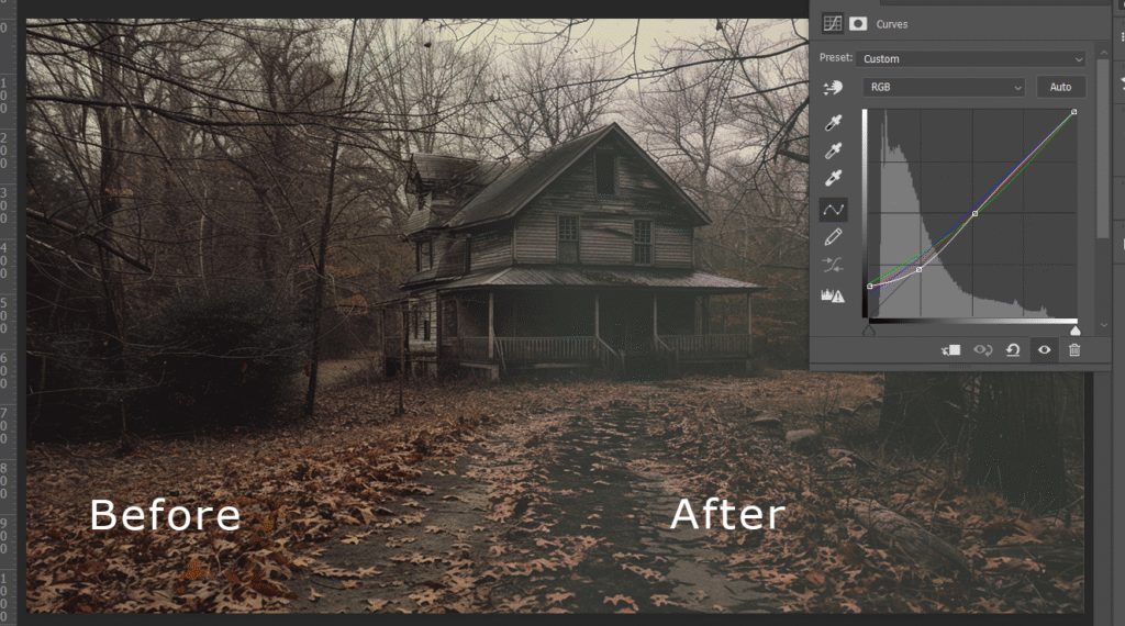
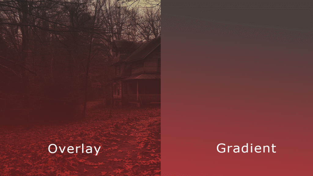
In this breakfats recipe for a horror survival cover image, the colour selection can be crucial in giving more atmospheric mood to the composition, so we will work wisely.
Now let’s jump into the colour selection. What does this mean? Well, in the image creation process, but also in photography or painting and web design, it’s common to identify a colour palette that contains some of the key colours or dominant colours, in photo editing one (mono-tone), two (duo-tone) or three (three-colour) that we want to use to compose our image.
And after this brief introduction, let’s dive into creating the project.
If we’re working for a landscape image, which is wider than high. We should consider properly managing space according to the “message” we want to communicate out there.
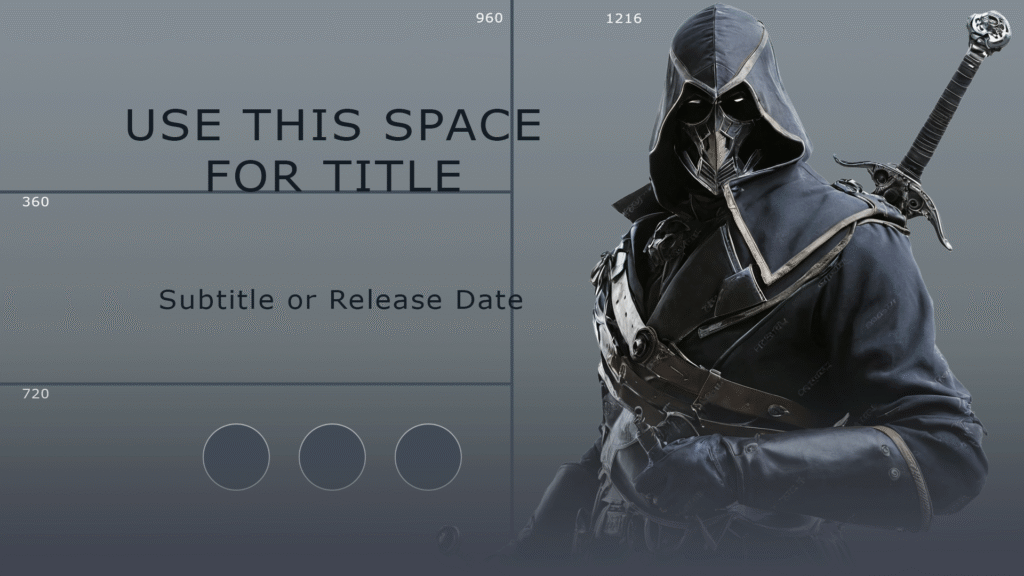
If your hero scene is intended to have a clear text message, you can adopt the following strategy. Virtually divide the content into 2 halves vertically and 3 parts horizontally. Now choose one of the 2 halves and insert a “photo” of what you consider the dominant element, in general a character or a team, while the second half will show text and icons when required, based on the 3 horizontal bands.
Why does this composition work? First of all, because we always have to consider that our ancient brain is naturally involved in watching images, especially if these images represent persons or characters, and then text. We are initially attracted to watch natural shapes instead of text. Text, in fact, contains a kind of coding language that our brain has to decode throughout a process known as semantics. So this required an additional effort for our ancient brain to bring the text content to the higher brain.
If you need to show a full-size character scene like a portrait scene, because you want to drive the spectator to “read” your message from top to bottom, things are going to be a little bit harder. Yes, this seems to be a paradox, but please consider that the portrait image is always harder to assimilate instantly. And that’s for a few reasons.
First, because our world is naturally horizontal. The same word “horizon” identifies the horizontal separation from the ground and the sky, so we normally tend to explore a large horizontal space. However, it is common to create hero and cover images with this goal in mind. If this is your case, try to focus on the centre of the composition, because that is the place where your scene happens. Then drive the spectator to the text message that you consider relevant for your audience, which can be the title and an eventual subtitle.
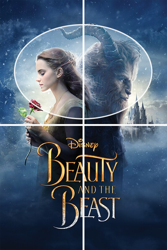
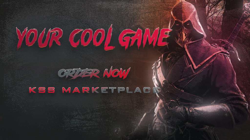
This cover image from the “Beauty and the Beast” movie is a good example of what was mentioned above. Drawing a cross that perfectly divides the image into 4 symmetrical parts, we can identify all the required text in the bottom half. In comparison, the top half contains the scene’s characters. We marked their faces to showcase how they appear a bit shifted to the centre of the composition. That’s because our brain tends to focus on it, excluding unused peripheral sides of a scene.
But this is a vertical (portrait) cover image. We show you this image as a first example to easier to figure out how to create a vertical composition. Let’s see horizontal examples below.
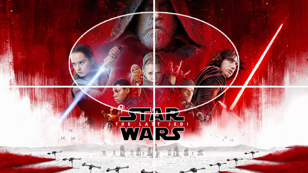
This cover image from the “Star Wars – The Last Jedi” movie is another example of how to create a “vertical” composition where the elements are centred and vertically placed. Like in the example above, in the case of the Beauty and the Beast movie cover, we have cut the image into 4 symmetrical parts again. Even here, the required text is placed in the bottom half of the composition, while the team and the major character are all placed in the bottom half. but as you can see, they are gently shifted a bit to the centre of the composition
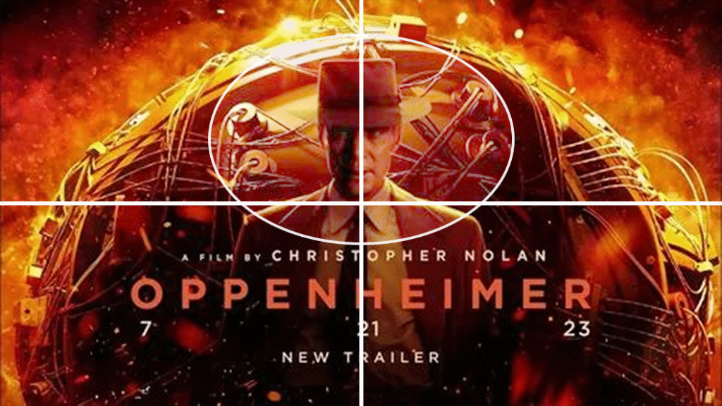
In this “Oppenheimer” movie cover same technique has been applied successfully. Please consider that, in this case, because of the plot, aside of the protagonist, which is the scientist shown at the centre of the composition, we have another “secondary” protagonist, the nuclear bomb. But because of the trick which is always better to drive the customer’s attention to something very emotional, like a character or a person, the terrible device has been placed as the background. In that case, we can even cover almost the full composition.
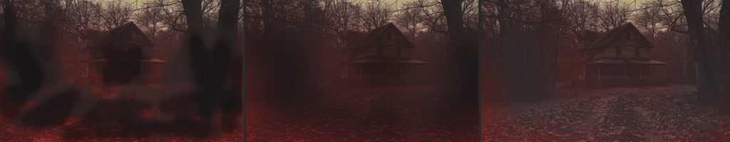
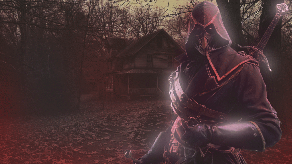
Back to our breakfats recipe for a horror survival cover image, it’s time now to start adding elements to our composition. Of course, this is based on your game, the characters or items you consider more relevant and the result you want to achieve. So please consider this article as a tutorial.
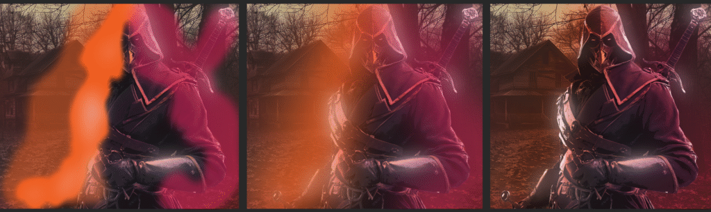
As you can see from the 3 pictures below, we added a character to our composition, and we started working on it as specified below.
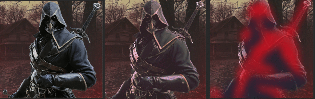
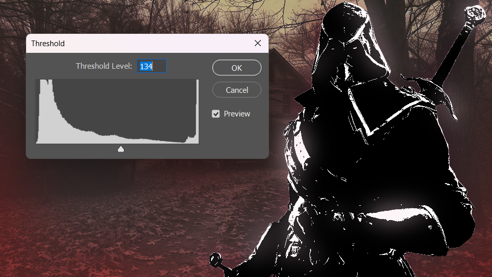
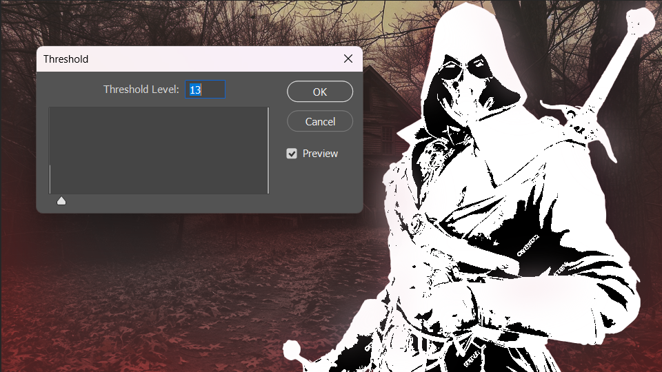
Now, create a new layer and using the same principle mentioned above, identify all the highlights in your character image and start roughly painting them with a very bright colour; you can even use the white colour. Blur this layer to create a kind of glow effect. Feel free to make some soft adjustments to the image, which can be hue, levels, curves, etc.
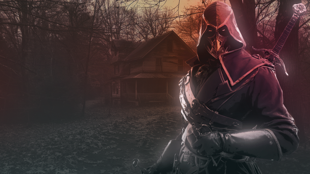
It’s time now to finalise the character editing, and we will proceed this way. First, duplicate your character layer twice, then apply the mask to prepare it for upcoming editing.
In general, it’s a good practice to try to partially “mix” or “blend” your characters with the rest of the composition and the background. Of course, there’s some part of your character that is more prominent, such as the face or head. If your game doens’t have any characters, try to identify what is the crucial or most important element of your game. For example, in the case of a racing game, the most important element can be a particular vehicle, so it can be the vehicle’s front, or in the case of a building sim or sandbox game, it can be some tools provided to the players.
So now we are going to do in the next step is marking the most important part of the character. It’s common practice to “blend” out the character to the bottom. There are many artistic techniques you can use. In this tutorial, we are gonna show you a method we use very often.
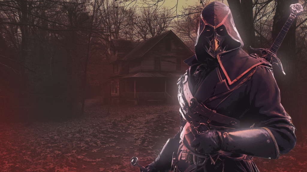
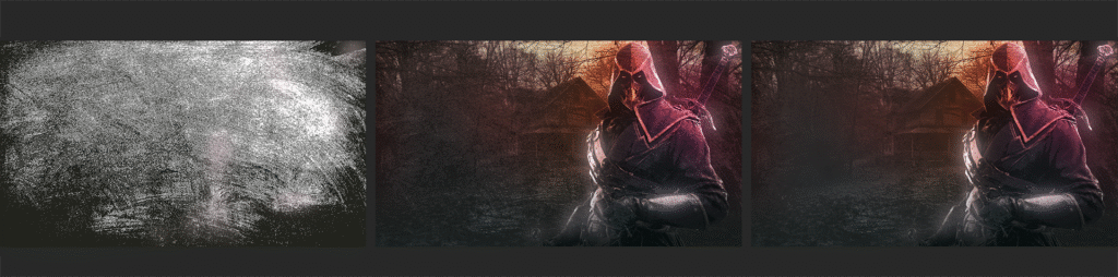
Yes you read it properly, “destroy”. Now it’s time to make your composition “dirty” and start “damaging” the entire image, especially in a case like this breakfats recipe for a horror survival cover image, where the horror atmosphere can also be given by a robust texture touch. Yes, this is a common and artistic method used everywhere. From image or video creation, music and mixing, painting and image communication. Wht? Because everything you create using a computer is digitally perfect, while reality is chaos and a mess. And so, that’s why, using additional methods to “damage” your composition can contribute to make it more appealing, complex and even more artistic.
One of the most “tricky” aspects of the image communication process and hero or cover image creation is undoubtedly the text creation. And if you surf on every digital marketplace out there, and you take a look at some of the cover images of many indie games or solo dev games, well… you can easily figure out what that means.
Text is placed somewhere in the composition, without balancing the “weights”. Fonts are also selected randomly, totally disrupting the image’s mood. Colours and tones calibrations, text processing and texturing are totally missing.
And this is because adding text to a composition seems to be an easy thing that doesn’t require any additional painting or image processing.
But the text has to clearly contain two very important thingss you have to use to drive a potential customer to know more about your game: title and call to action!
Even in our marketplace, your hero and cover image should only have your game title and a specific call to action such as the release date, or when to order. So let’s jump into how to add text to your composition without destroying the job done before.
Please always consider what is mentioned above in this article about elements placement. So based on that simple rule we can proceed in adding text to our composition.
Your title should be prominent and based on font style in alignment with your game’s mood. It’s better not to use a Sci-Fi font style in a fantasy RPG game, isn’t it? To avoid any mistakes, search your font based on themes. Most of the major websites where you can download fonts allow you to search by themes: from https://www.dafont.com, or https://fonts.google.com/, or https://www.1001fonts.com/ and so on.
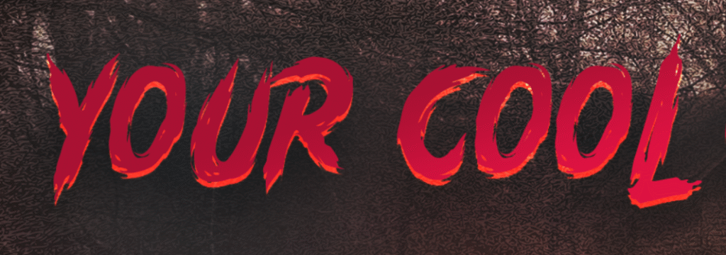
As a final touch, we placed an additional soft texture background behind the text, then we partially masked this background to disclose a bit more the original background. Now, feel free to retouch a bit where needed.